常见的css面试
# 序言
此篇文章讲的主要是面试时css问题,提供了一些常见的css面试题,和一些经典的布局案例,如果有问题欢迎提出issue,一起探讨,一起进步。
# 阐述一下h5新增的一些新的特性?H5
- 新增一些语义化标签,和表单的一些新属性如 header main nav footer
- 加强对音频audio视屏video处理,用来替代flash播放
- webrtc实时音视频处理
- canvas/webGL
- webscoket技术
总结
面试官这样问可能是想问你h5处理音视频方面,不是新增的语义化标签。毕竟这是h5最大的亮点。
# 如何理解语义化标签?
- 什么标签干涉么事
- 有利于网页的seo优化
- 可以清晰的展示网页结构
# 讲讲盒子模型吧!
盒子模型种类
- 标准盒模型 w3c
- 怪异和模型 IE盒模型
# html有哪些标签?
- 块级标签 div、h1-h6、p、ul、ol、li、dl、dt、form h5新增的header、nav、main、section、article、footer sidebar、
- 行块标签 img input
- 行内标签 span、a、s、u、b、i、label、em、strong、button
注意
面试官可能是问标签的显示模式分类,块级标签,行级标签,行块标签,在一一举个列子,元素之间可通过显示模式进行转换display,block inline-block inline flex table
盒子模型组成如下图:
margin,border,padding,content
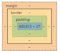
盒子模型width计算
- 标准盒模型 盒子真实宽度 = border + padding + content(你设置的width)
当你设置一个div的宽度时只是它内容的宽度,所以往往你设置盒子宽度时,要注意boder和padding是否设了值, 如果设置就需要减去
- 怪异盒模型 盒子真实宽度 = 你设置的width
标准盒模型和怪异盒模型之间的转化
css3提供了一个属性box-sizing,提供了三个属性值border-box,content-box,这样通过设置不同属性值实现盒子模型转换
.box{
    box-sizing: border-box; /*ie盒模型*/
    box-sizing: content-box; /*标准盒模型*/
}
2
3
4
# 讲讲flex布局吧
flex弹性盒模型,他有俩个轴,主轴和交叉轴,默认主轴方向是水平方向,交叉轴与主轴垂直。父元素display:flex;将其转化为flex布局容器,其子元素变为一个个flex-item子项,呈并排排列,并且flex子项拉伸至与父容器高度相同。默认flex-shink:0;flex-grow: 1;
# 将一个元素水平和垂直方向居中
- 方法一:利用postion + margin:auto; + 四个方位为0
.wrapper{
    position: relative;
    height: 100vh;
    .box{
        position: absolute;
        width: 100px;
        height: 100px;
        left: 0;
        right: 0;
        top:0;
        bottom: 0;
        margin: auto;
        background-color: skyblue;
    }
}
2
3
4
5
6
7
8
9
10
11
12
13
14
15
注意
必须设置盒子宽高
- 方法二: position + margin负值
.wrapper{
    position: relative;
    height: 100vh;
    .box{
        position: absolute;
        width: 100px;
        height: 100px;
        left: 50%;
        right: 50%;
        margin-left: -50px;
        margin-top: -50px;
        background-color: skyblue;
    }
}
2
3
4
5
6
7
8
9
10
11
12
13
14
注意
- 必须设置元素宽高,在利用定位左上距父元素50%,margin负自身宽高一半,
- 缺点需要计算子元素的宽高一半值
- 方法三:position + transform
.wrapper{
    position: relative;
    height: 100vh;
    .box{
        position: absolute;
        width: 100px;
        height: 100px;
        transform: translate(-50%, -50%);
        background-color: skyblue;
    }
}
2
3
4
5
6
7
8
9
10
11
提示
- 必须设置元素的宽高
- 不兼容ie9以下
- 方法四: 利用table
.wrapper{
    width: 500px;
    display: table-cell;
    height: 500px;
    text-align: center;
    vertical-align: middle;
    .box{
        width: 100px;
        height: 100px;
        display: inline-block;
        background-color: skyblue;
    }
}
2
3
4
5
6
7
8
9
10
11
12
13
- 方法五: 利用flex布局
.wrapper{
    display: flex;
    height: 100vh;
    width: 100vw;
    justify-content: center;
    align-items: center;
    .box{
        width: 100px;
        height: 100px;
        background-color: skyblue;
    }
}
2
3
4
5
6
7
8
9
10
11
12
# 几种三栏布局
- 双飞翼布局 思路一: float + margin负值
画图分析:如下图
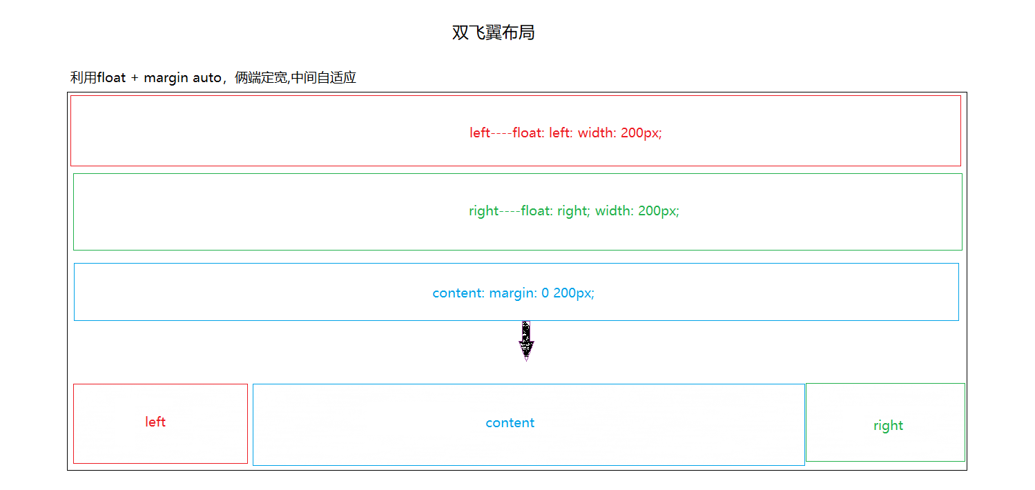
- 方法一
<style lang="scss">
    body,html{
        margin: 0;
    }
    /*  清除浮动*/
    .clearFix::after{
        content: ' ';
        display: block;
        clear: both;
        visibility: hidden;
        font-size: 0;
    }
    .left,.right{
        width: 200px;
        height: 300px;
    }
    .left{
        float: left;
        background-color: red;
    }
    .right{
        float: right;
        background-color: blue;
    }
    .content{
        margin-left: 200px;
        margin-right: 200px;
        background-color: pink;
        min-height: 500px;
    }
</style>

<div class="container clearFix">
    <div class="left">left</div>
    <div class="right">right</div>
     <div class="content">
    </div>
</div>
2
3
4
5
6
7
8
9
10
11
12
13
14
15
16
17
18
19
20
21
22
23
24
25
26
27
28
29
30
31
32
33
34
35
36
37
38
解释
实现这种布局原理: 利用float脱离文档流,left,right脱离文档流,文档流下面的content就会往上靠, 但此时left,right的宽度会遮住,content的一部分,给content设置margin-left,margin-right左右俩边容器宽度的值就行
缺点: content内容区域最后渲染
- 方法二
<style lang="scss">
    body,html{
        margin: 0;
    }
    /*  清除浮动*/
    .clearFix::after{
        content: ' ';
        display: block;
        clear: both;
        visibility: hidden;
        font-size: 0;
    }
    .container{

    }
    .left,.right{
        width: 200px;
        height: 300px;
    }
    .left{
        float: left;
        margin-left: -100%;
        background-color: red;
    }
    .right{
        float: right;
        background-color: blue;
        margin-left: -200px;
    }
    .content{
        float: left;
        width:100%;
    }
    .inner{
        margin-left: 200px;
        margin-right: 200px;
        min-height: 500px;
        background-color: pink;
    }
</style>

<div class="container clearFix">
    <div class="content">
        <div class="inner">inner</div>
    </div>
    <div class="left">left</div>
    <div class="right">right</div>
</div>
2
3
4
5
6
7
8
9
10
11
12
13
14
15
16
17
18
19
20
21
22
23
24
25
26
27
28
29
30
31
32
33
34
35
36
37
38
39
40
41
42
43
44
45
46
47
48
解释
实现原理: content,right,left全部左浮动,脱离文档流,触发了bfc,当content设置宽度100%时,left,right自然会被挤下换行,left元素再设置margin-left: -100%;right元素margin-left负的自身宽度,margin-right: -200px;
margin负值单位%相对于父元素的width
思路二:position + margin
<style>
    body,html{
        margin: 0;
    }
    .content{
        position: relative;
        min-height: 100vh;
        margin-left: 200px;
        margin-right: 200px;
        background-color: pink;
        min-height: 500px;
    }
    .left,.right{
        position: absolute;
        width: 200px;
        height: 200px;
        background-color: red;
    }
    .left{
        left: 0;
    }
    .right{
        right: 0;
        background-color: blue;
    }
</style>

<div class="container">
    <div class="content">content</div>
    <div class="left">left</div>
    <div class="right">right</div>
</div>
2
3
4
5
6
7
8
9
10
11
12
13
14
15
16
17
18
19
20
21
22
23
24
25
26
27
28
29
30
31
32
解释
实现原理: left,right利用绝对定位定位在左右两边,中间可用margin空出left,right宽度距离。
思路三: 利用flex布局
<style>
    body,html{
        margin: 0;
    }
    .container{
        display: flex;
        height: 100vh;
        min-height: 100vh;
    }
    .content{
        flex: 1;
        background-color: pink;
    }
    .left,.right{
        width: 200px;
        background-color: red;
        flex-shrink: 0;
    }
    .right{
        background-color: blue;
    }
</style>

<div class="container">
    <div class="left">left</div>
    <div class="content">content</div>
    <div class="right">right</div>
</div>
2
3
4
5
6
7
8
9
10
11
12
13
14
15
16
17
18
19
20
21
22
23
24
25
26
27
28
解释
实现原理: 父元素设置display:flex;形成flex布局,子元素成为flex子项,自动呈现水平排列,将content区域设置为flex: 1;意思就是当前项自动增长,和压缩。相当于flex-shirnk: 1;flex-grow: 1;左右俩边设置定宽,则中间会占满剩余空间。
缺点: 只支持IE9以上
如果不懂flex布局,可以参考阮一峰的这篇博客教程flex布局教程
- 圣杯布局 float + margin负值 + position
<style>
    body,html{
        margin: 0;
    }
    .container{
        padding: 0 200px;
    }
    .content{
        width: 100%;
        min-height: 500px;
        float: left;
        background-color: pink;
    }
    .left,.right{
        width: 200px;
        height: 300px;
        float: left;
    }
    .left{
        background-color: red;
        margin-left: -100%;
        position: relative;
        left: -200px;
    }
    .right{
        background-color: blue;
        margin-right: -200px;
    }
</style>

<div class="container clearFix">
    <div class="content">content</div>
    <div class="left">left</div>
    <div class="right">right</div>
</div>
2
3
4
5
6
7
8
9
10
11
12
13
14
15
16
17
18
19
20
21
22
23
24
25
26
27
28
29
30
31
32
33
34
35
解释
实现原理: 外面container容器设置左右内边距,content,right,left,设置浮动。当content设置100%时left,right自然换行显示,设置left为margin-left: -100%;后与content最左边对齐。再相当于自身位置偏移-200px;即可;right元素只需负的右边距200px;
- 多列布局
<style>
    .container{
            column-count: 3; /*设置列数*/
            column-gap: 50px; /*设置列间距*/
            column-rule: 1px solid yellowgreen; /*列规则系列*/
        }
        .content{
            background-color: pink;
        }
        .left{
            background-color: red;
        }
        .right{
            background-color: blue;
        }
</style>

<div class="container">
    <div class="content">content</div>
    <div class="left">left</div>
    <div class="right">right</div>
</div>
2
3
4
5
6
7
8
9
10
11
12
13
14
15
16
17
18
19
20
21
22
结语
上面是我看学习面试视频的一些总结,包括一些面试技巧,一些常见的css面试题,经典的三栏布局。 也相当于是我复习以前掌握不太扎实的知识吧。
面试
了解js的几种常见得设计者模式,了解TypeScript。
熟悉bootstrap框架,css预处理语言less,scss。
熟悉nodejs,express框架,了解next.js框架,mongodb数据库。
了解后端php技术,java技术。了解mysql数据库。
熟悉微信小程序开发,uniapp开发,打包上线流程。
熟练使用element-ui,iview,ant-design等一些ui组件库。
熟悉vue框架,了解vue服务端渲染技术,了解nuxt.js框架。
了解vue3.0。学习了vue3.0beta的一些新技术
了解react框架。了解过gulp构建工具。
熟悉前端的MVVM设计思想。
喜欢学习新技术,并且分享给小伙伴。
平时学习时喜欢到掘金,csdn看一些博客,然后自己总结,归纳。
平时学习时也喜欢将所学的知识写成博客。
app项目
响应式项目
小程序项目
后台管理系统项目
本人比较注重用户体验,交互设计。